

Traditional bios feel like a calculated exercise in puffing oneself up without appearing to do so. That doesn’t sit well with me.
After 35+ years as an economic model builder, I’ve decided to skip the corporate prose entirely. Because I’m autistic, I process the world—and my own story—through structured data. I’m introducing myself using my preferred medium: 12 clustered bar charts. They easily beat pie charts (which I abhor)—offering a far more exacting picture of who I am, from my professional credentials to my quirks and oddities.
I hope you find the data informative—and at least a little entertaining.
I. An Economist With a Past
First there's the obvious things you might want to know...
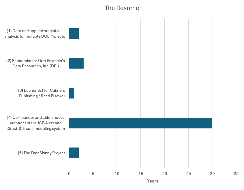
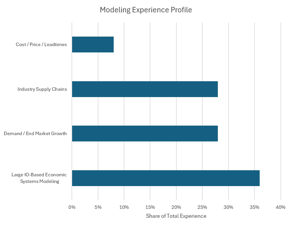
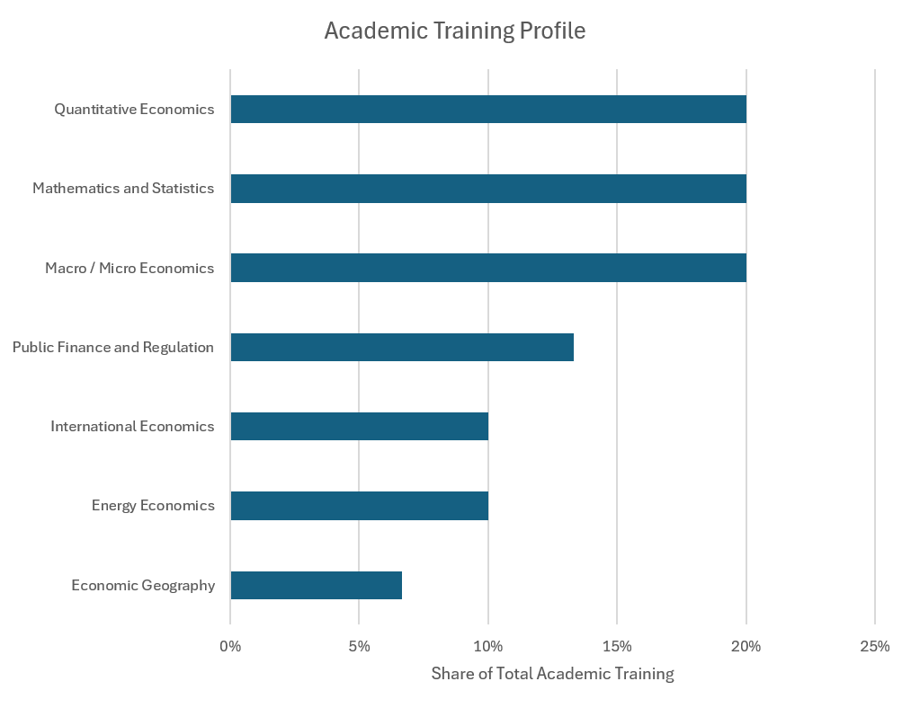
II. And Then There's the School of Hard Knocks
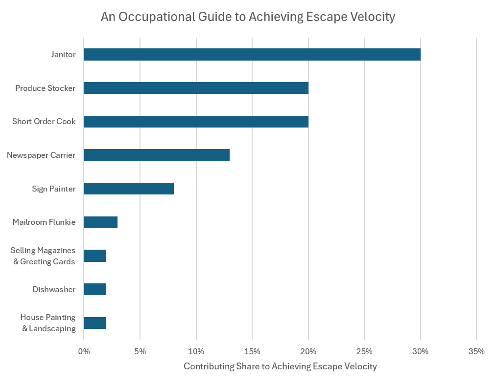
If I stopped with a traditional accounting of my experience, you wouldn’t understand the relentless drive powering DataSkinny.
Growing up in poverty meant that math wasn't just an academic subject—it was my way out. I worked every job available to fund my ambition, building real-world financial savvy from the ground up and earning the support of employers and customers who fed me extra hours, gave me advice and who genuinely believed in and supported my determination.
Today, I’m deeply grateful for that journey. It taught me to love hard work and gave me a perspective you can't learn in a traditional classroom. With DataSkinny, a relentless work ethic and an intense desire to get things right is the baseline. I apply that exact rigor to every modeling challenge and every report that gets published.
You may or may not care about this next chart but not a day goes by that I don't remember where I came from.
III. Office Sweet Office
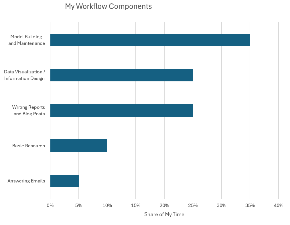
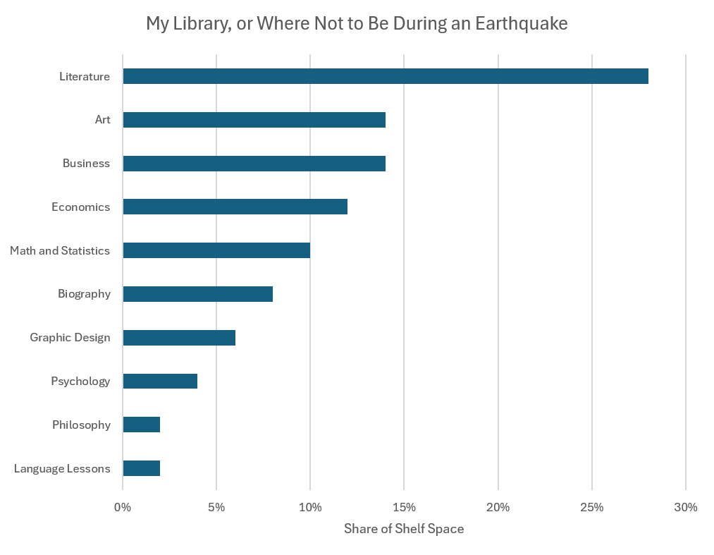
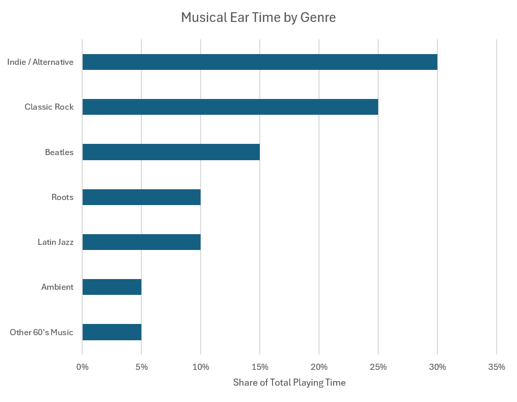
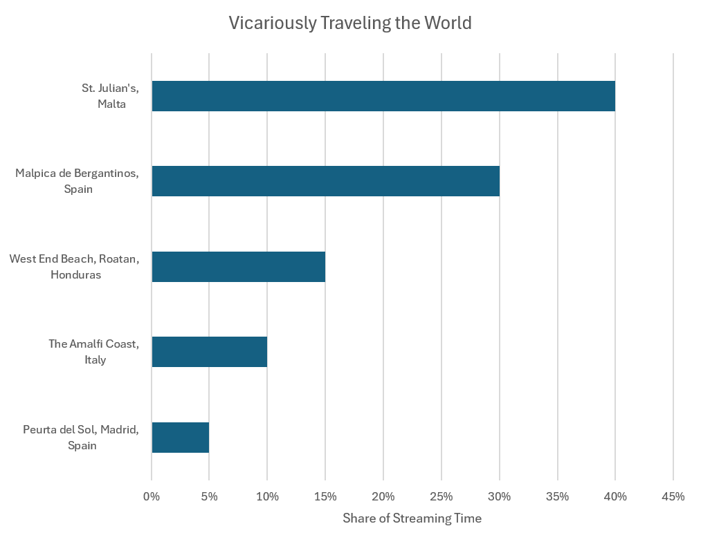
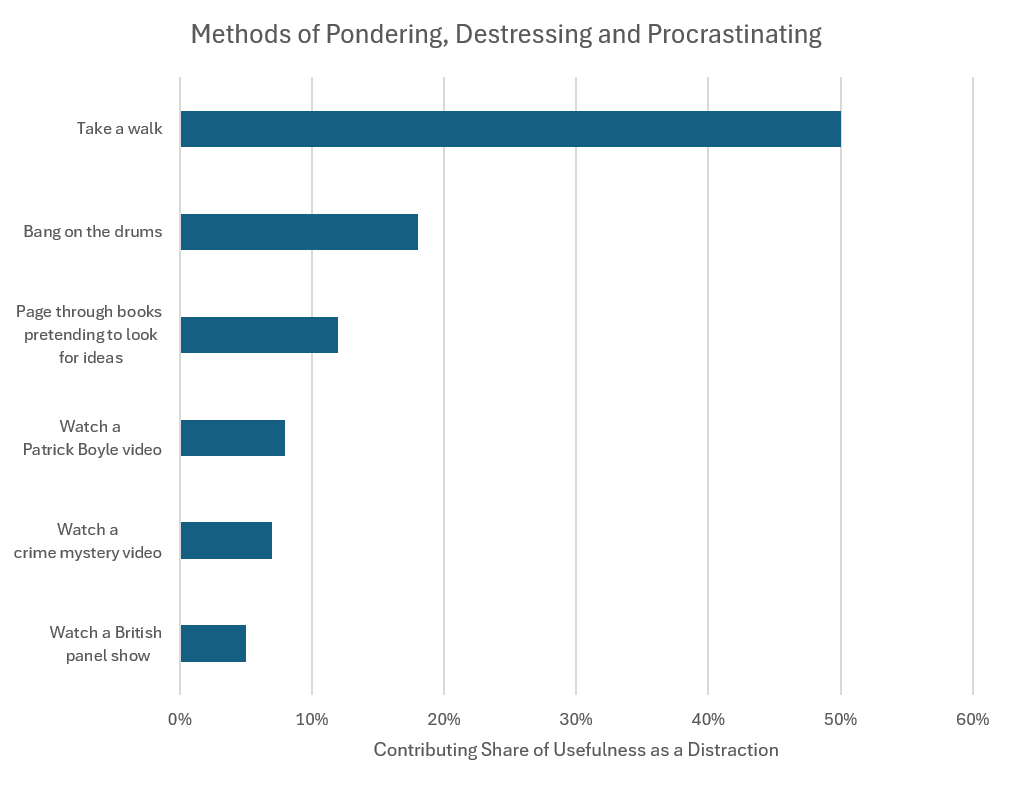
About seven years into corporate life, I noticed my office plant was doing better under the fluorescent lights than I was. Today, my office is a different world. It’s flooded with natural light and washed in an eclectic, constant stream of music. There’s a library with an ungodly number of books and a monitor streaming Skyline webcams from around the globe. Conspicuously absent? Cell phones, social media, and the chatter of the 24-hour news cycle. Ahh, office sweet office.
IV. Icebreakers for Your Consideration
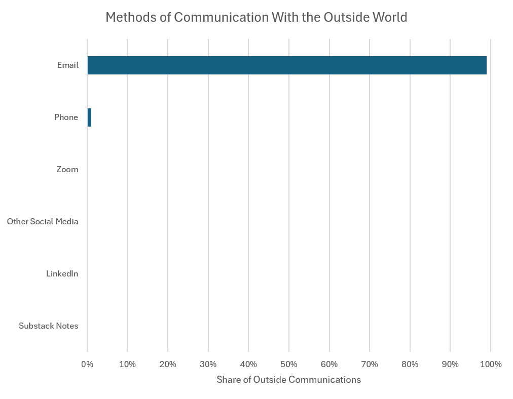
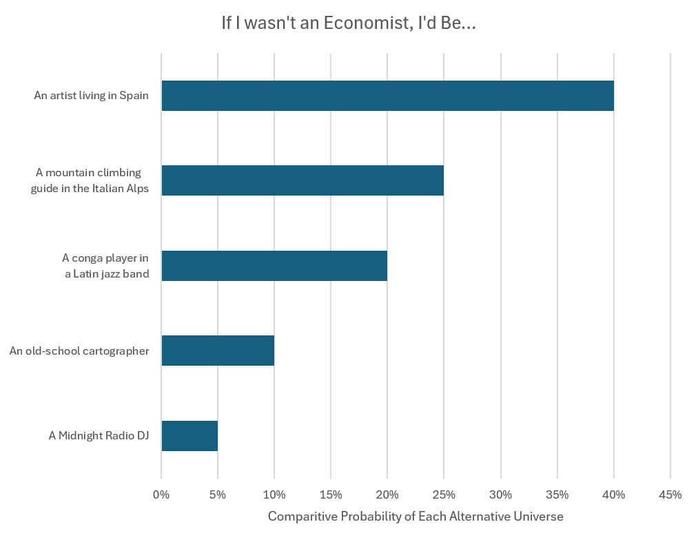
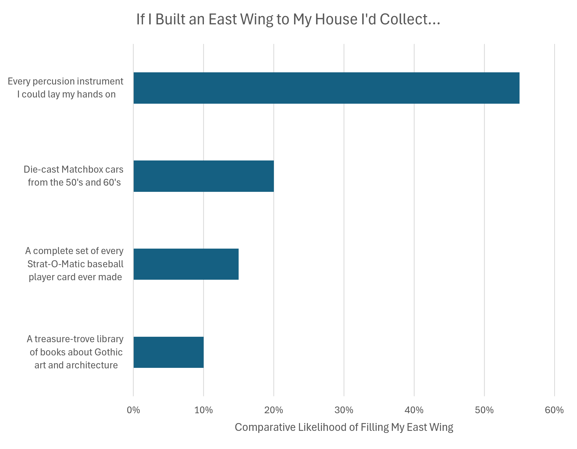
As you can surmise from the communication chart, I tend toward asynchronous methods. This approach helps me better manage my workload and answer questions in a considered manner. This shouldn't be mistaken for unapproachability; while I rarely initiate discussions, I always enjoy a compelling back-and-forth about economics. Outside of data, my interests are varied and sometimes intense—and these last two admittedly playful charts might shine a light on topics of mutual interest that can serve to break the conversational ice.
Thank you to everyone supporting DataSkinny and my past projects. If you have any questions, don't hesitate to ask!